-------
about the project
PSafe is a global billion-dollar company that provides mobile privacy, security, and performance apps. It needed a website redesign to improve mobile friendliness and, most importantly, create an experience that drives downloads for its dfndr apps.
It was designed in 2018, and they still use this design nowadays.
-------
my role
Responsibilities
Research, wireframes, prototyping, UI design, and illustrations.
Research, wireframes, prototyping, UI design, and illustrations.
Collaboration
Worked closely with the Channel Marketing Manager, the Art Director and a Freelance Developer.
Note
Due to contractual agreements, benchmarking and competitive analysis details are not included.
Due to contractual agreements, benchmarking and competitive analysis details are not included.
-------
main challenge
How to Help Users Find & Download the Right dfndr App?
PSafe offers five different dfndr products, each with unique security and performance features. The challenge was to create an intuitive way for users to understand the differences and select the best app for their needs—all while ensuring high conversion rates.
-------
-------
ideation and concept development
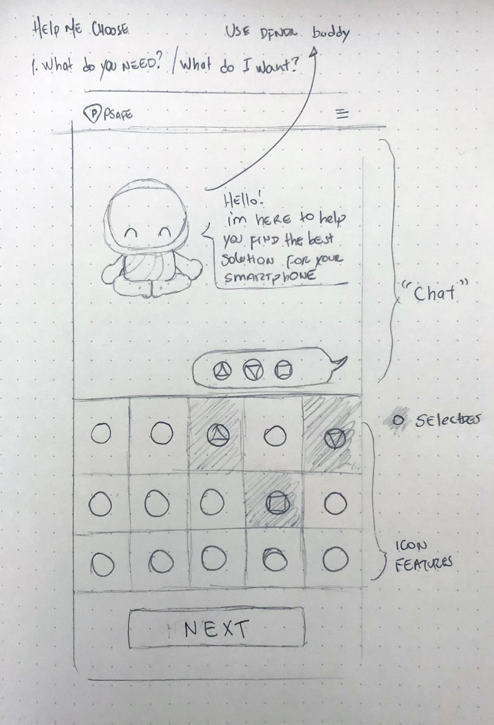
I started by sketching early concepts on paper to explore solutions quickly.
Initial Approach
Use PSafe's mascot as a virtual assistant to guide users through a chat-like experience.
Use PSafe's mascot as a virtual assistant to guide users through a chat-like experience.
First Iteration
The mascot would introduce itself, ask users what they were looking for, and recommend the right dfndr app.
The mascot would introduce itself, ask users what they were looking for, and recommend the right dfndr app.
Feedback & Refinement
Initial tests showed that too much information at once led to disengagement—users would scroll past instead of interacting.
Initial tests showed that too much information at once led to disengagement—users would scroll past instead of interacting.
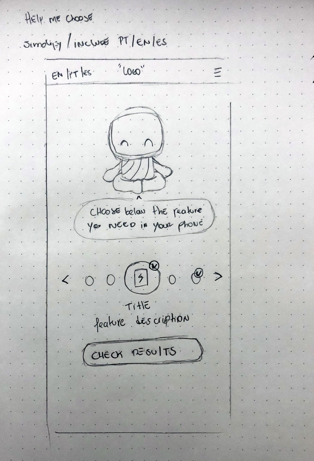
We simplified the interface
The users would select one feature instead of an open-ended chatbot, and the system would immediately suggest the best app.
The users would select one feature instead of an open-ended chatbot, and the system would immediately suggest the best app.
-------
-------
UI Design & Prototyping
With the wireframes approved, I transitioned into the high-fidelity UI design phase, ensuring a clean, user-friendly experience while reinforcing PSafe's brand identity.
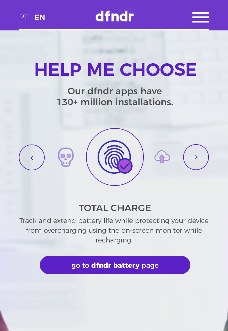
Homepage & Help Me Choose Tool
Streamlined Navigation
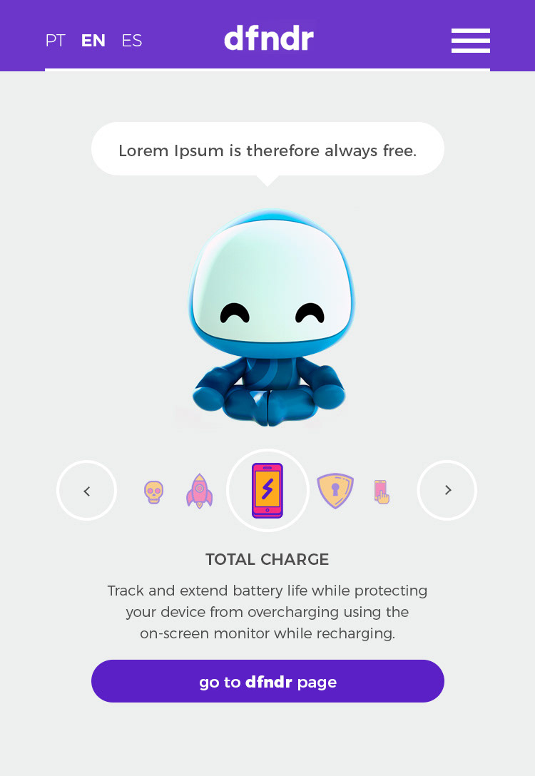
Designed an interactive tool to guide users in selecting the best dfndr app based on their needs.
Designed an interactive tool to guide users in selecting the best dfndr app based on their needs.
Brand Consistency
Applied PSafe's color palette, typography, and design system to maintain a cohesive look across all pages.
Seamless User Flow
Users could explore features, select their main concerns (security, privacy, performance), and receive a direct recommendation.
-------
DFNDR Product Pages
Focused Product Presentation
Each dfndr app had a dedicated page, providing a clear breakdown of features, premium benefits, and credibility markers like ratings and reviews.
Each dfndr app had a dedicated page, providing a clear breakdown of features, premium benefits, and credibility markers like ratings and reviews.
Conversion-Driven Layout
Ensured a strong call-to-action, making it easy for users to download the recommended dfndr app directly.
Consistency & Usability
Optimized the interface for mobile, keeping content digestible and engaging.
-------

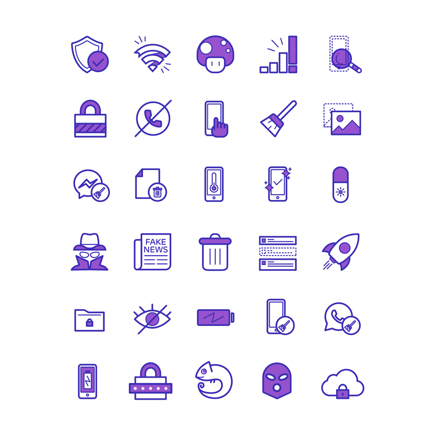
Icons and Illustrations aligned with PSafe's Design System
To enhance the user experience and maintain visual consistency across PSafe's ecosystem, I designed a set of icons and illustrations that define key app features.
Design System Alignment
Ensured all assets followed PSafe's established brand guidelines, including stroke weight, color schemes, and visual hierarchy.
Ensured all assets followed PSafe's established brand guidelines, including stroke weight, color schemes, and visual hierarchy.
Feature Representation
Created icons and illustrations to communicate app functionalities, making it easier for users to understand each product’s value at a glance.
Scalability & Clarity
Optimized designs for different screen sizes, ensuring crisp and recognizable visuals across mobile and web.
These elements not only strengthened the brand's identity but also improved usability by making interactions more intuitive.
---
The PSafe website redesign was a successful, long-lasting project that effectively improved user engagement and app downloads. Over the three-month design process, I worked closely with the marketing and development teams to create an intuitive, conversion-focused experience.
From 2018 to today, the website remains in use, proving that the design continues to meet business needs and provide a seamless experience for users. This longevity highlights the strength of the UI, information architecture, and Help Me Choose Tool, ensuring that users can easily find and download the right dfndr app.

